24 February 2010

Stratford-upon-Avon

On Saturday I took a daytrip to Warwickshire with Philippa and Toakase to visit Stratford-upon-Avon, the birthplace of the eternal bard, William Shakespeare.  It was only my second visit, having spent a couple of days there in 1997 with my Canadian chums, during which time we saw a bizarre yet riveting Royal Shakespeare Company performance of Cymbeline.  This time it was just for the day, and the RSC was only running a single evening performance of King Lear so there was no chance to watch the board-treaders.  But in our six hours we fitted in a decent survey of the town’s main attractions. 

In this endeavour we were assisted by the most superb winter sunshine and warmth imaginable.  The farms of Warwickshire were sprinkled with snow as the train headed northwards and the overnight forecast had been for a high of five degrees and a light snowfall during the day, but instead we were treated to beaming rays and balmy temperatures.  We even ate our pub lunch (fine fare at the Dirty Duck) outside to take advantage of the vitamin D. 

Some edited highlights:

SONY DSC 

A cunning man did calculate my birth… (Suffolk, King Henry VI Pt 2)


Shakespeare’s birthplace in Henley Street, which is two late 15th or early 16th-century houses knocked together.  It was originally part of a row of similar dwellings, but the locals knocked down the adjoining houses in 1857 for fear of an outbreak of fire destroying the birthplace.  Now the house is at the centre of a busy pedestrian arcade and is accompanied by an ugly visitor centre (left background).


---


[1] Photo folders, Stratford-upon-Avon Feb10, 2 images, DSC04133 - DSC04134 - 4998x3801 - SCUL-Smartblend


Go back again, and be new beaten home?  For God's sake, send some other messenger (Dromio of Ephesus, The Comedy of Errors)


New Place, Shakespeare’s Stratford home from 1597 until his death in 1616, is now a memorial garden.  Richard Sale, in his guidebook The Cotswolds & Shakespeare Country (2009) explains why:


[Following Shakespeare’s death] the house was left to Dr John Hall and his wife Susanna, Shakespeare’s eldest daughter.  Following their deaths the house had many owners, passing eventually to Rev Francis Gastrell in the mid-eighteenth century.  By then Shakespeare’s reputation was such that the house attracted many visitors, much to Gastrell’s annoyance.  So many came to sit under Shakespeare’s mulberry tree – where, reputedly, the poet had sat – that in 1756 Gastrell cut it down.  The bitter confrontations which followed this vandalism culminated, in 1759, in Gastrell’s demolition of the house.  Such was the outrage at this that Gastrell was forced to leave Stratford.


---


SONY DSC 

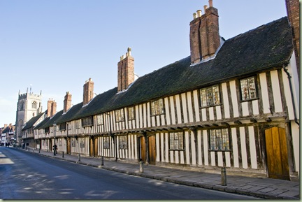
One bred of alms and foster'd with cold dishes… (Cloten, Cymbeline)


These early 15th-century almshouses on Church Street were built by the Guild of the Holy Cross to house the worthy poor, and are still used for that purpose today.  The chimneys were constructed rather tall to minimise the risk of sparks igniting the original thatched roof.


---


[1] Photo folders, Stratford-upon-Avon Feb10, 2 images, DSC04155 - DSC04156 - 3376x3152 - SCUL-Smartblend 

Here lie I down, and measure out my grave… (Adam, As You Like It)


Shakespeare’s grave lies in the Holy Trinity Church – it’s the one outlined in black at the bottom left of the picture.  The inscription reads:


Good Frend for Jesus sake forbeare


To digg the dust encloased heare!


Blese be ye man yt spares thes stones


And curst be he yt moves my bones


Above the grave is the memorial bust of Shakespeare carved two years after his death but said by his wife to be a decent likeness.  Never fear, they renew the feather quill when it gets a bit manky.


---


SONY DSC 

All comfort that the dark night can afford be to thy person, noble father-in-law! (Richmond, King Richard III)


Anne Hathaway’s Cottage is in the village of Shottery a short distance outside Stratford.  The suburbs have since swallowed up the distance between the two, but you can still walk the path to the cottage and wonder if Shakespeare took the same steps when he was courting his bride-to-be.  The fifteenth-century dwelling is that of a relatively prosperous farmer, and the surrounding gardens have been modelled on gardens of that era.  Inside, one upstairs room features two noteworthy relics: the Hathaway Bed and the Shakespeare Chair:


SONY DSC  DSC04167


The bed, according to the Cottage museum website, ‘may well have been the one valued at £3 in 1624, on the death of Anne Hathaway's brother’.  Equally, it may well be an entirely different bed, but never mind.  The Chair may have been a courting settle with which William and Anne conducted their romance, but again, we have no proof other than the fact that the Shakespeare crest was carved upon it at some point.  The Chair was lost to the Cottage from 1792, when an unscrupulous collector persuaded someone to sell it to them, until its rediscovery in 2002.


Further reading


Text search: The Collected Works of Shakespeare


Pub lunch: The Dirty Duck


Tourism: Visit Stratford


More photos: Facebook album

20 February 2010

Mock The Week

1

On Tuesday night I lined up with Toakase and Emily outside the BBC TV Centre in White City for a recording of the BBC comedy panel show Mock The Week, which is one of the most popular shows on the BBC.  I was lucky enough to score the free tickets in a ballot a month or two ago, having missed getting into recordings in previous series. 

After the warm-up comedian, who joked that Keith was an incongruous name for a baby, the series producer Dan Patterson appeared to answer questions and introduce the comedians on the show that evening.  One pertinent question from the audience was ‘when’s Frankie Boyle coming back?’ 

For those not in the know, Boyle was the undoubted star of Mock The Week’s first seven series, and the acerbic controversy-courting Scottish comedian became a star on the UK gig circuit as a result of his TV appearances.  But Boyle recently quit Mock The Week after a tabloid frenzy of hypocritical indignation against some of his more close-to-the-bone quips.  Tired of the pointless flak, he left the show to focus on his stand-up career and to develop a new comedy show for Channel 4.  Patterson was diplomatic and sympathetic, pointing out that Boyle had a long history on the show and that he would be welcome back in the future if he decided he wanted to appear: ‘never say never’ was mentioned.  Hopefully Boyle will take up the offer one day soon.

It was the last show in the series, and the producers had organised a strong line-up – the only possible downside being the lack of female comedians despite a recent attempt to dilute the sometimes uniform blokey-ness of the show.  Host Dara O’Briain coped well with a strong headcold that failed to dull his obvious sense of enjoyment in the proceedings.  Sprightly Chris Addison, fresh from his hilarious role in the triumphant In The Loop and his own successful national stand-up tours, proved particularly versatile, running the gamut from middle-of-the-road Michael McIntyre-style observational humour to political satire to Pythonesque whimsy.  Unofficial team captain Hugh Dennis, of Now Show and Punt & Dennis fame, impressed with his regular voice-over slot, proving that his Queen voice was just as entertaining as his justly-famed Prince Phillip voice.  The neophyte Scottish comedian Kevin Bridges betrayed a few nerves here and there but emerged with some strong material that had the audience roaring its approval.  Potential Bond villain lookalike Andy Parsons secured his status as a cleverer version of Al Murray the Pub Landlord and deployed the strongest topical gags in large numbers.  Louche Irish comedian Ed Byrne, who I saw perform in Wellington last year, excelled in wry asides and got to deploy his wedding planning material from his stand-up show.  Lastly, the youthful exuberance of Russell Howard provided energy and plenty of absurdist childhood reminisces.

I was particularly impressed with the calibre of the performances.  Bear in mind that Mock The Week is a half hour non-commercial broadcast.  Once you include opening and closing credits and introductions you’re getting close to a mere 25 minutes of air time for comedy purposes.  But they recorded for at least two and a half hours, and to the performers’ credit nearly all of the material they offered was of the highest quality that could have appeared on a conventional stand-up comedy billing. 

Andy Parsons impressed me in person because on TV his mannerisms seem rather smug: sidling up to the microphone with a sly grin to milk audience laughter.  But in the unedited recording you can see the work he puts into it – he offers probably the largest number of jokes of any of the performers, and strings them together artfully so that by the end of the recording there’s some continuity in his material and he’s established a rapport with the audience.  In person he deserves that rapport – it’s just that 80 percent of all the material on offer will end up on the cutting room floor.  Parsons also wins my vote for being the only comedian to actively encourage new boy Kevin Bridges to take the mic in the quick-fire rounds, which is a first-come first-served situation often dominated by the pushiest comedians.

Seeing the show broadcast in its final, 30 minute version two days later was a reminder of how dense Mock The Week is: they really scramble to shoehorn the largest possible number of jokes into the airtime and the show proceeds at a frantic pace.  It’s also pleasing to see one minor mystery confirmed: despite what the TV trainspotters might say, the points that O’Briain awards to each team are completely imaginary and the scoring system has no bearing on the ‘winners’ declared at the end of the programme.  O’Briain said as much when he was introduced at the beginning of the programme, joking that people really should stop emailing to ask him about it.  To prove his point, at the end of each round each of the teams recorded a ‘happy points’ reaction shot of them being told they’d won the round, and at the end of the show each team recorded victory celebrations and defeated commiserations, so presumably the ‘winners’ were selected by the producers in the editing suite.  Because after all it’s not a race, it’s comedy!

12 February 2010

Passport design fail

I know I won’t win friends by saying this, and I know not many people will agree with me when I say it.  The new New Zealand passport design, featuring as it does the bold silver fern on black markings of countless All Black rugby supporters’ banners, is a step backwards in terms of design and I wish I could keep my old one. 

I’ll even go further and say that the growing trend of stamping this silver fern logo on everything to do with New Zealand has only slightly more merit than the feeble cliché of replacing the letters ‘…ns’ at the end of words like Visions or Creations with the letters ‘…nz’ to make Visionz or Creationz, which in turn is just about as clever as those tedious people who think writing in Comic Sans gives a document a non-threatening, easy-read feel or that the sign-writing for children’s playcentres has to have ‘adorable’ mis-spellings or the letter S written backwards to simulate innocent ignorance. 

There.  I said it.  I’ve equated the silver fern, beloved symbol of many thousands of New Zealanders, with the trait of ignorance.  If I had a house New Zealanders would probably now try to burn it down, because that’s what we do now when something disagreeable happens.  Pitchforks may well be involved at some point too.

This all begins in my recent application for a replacement passport to my trusty old document, which is now slightly worn around the edges but full of hard-won border stamps.  (It always feels like a bit of a let-down if they don’t bother to give you a stamp when you enter a new country, doesn’t it?)  Due to my upcoming travel arrangements I felt I should probably apply for a new passport early, despite my current one being valid until August.  My preliminary queries to the DIA office at the NZ High Commission in Haymarket revealed that they were still issuing the old format NZ passport, which was something of a relief – I wanted to get my application in before the old stock ran out and was replaced by the new upstart passport.

But as soon as I opened the envelope I knew I was stuck for the next five years with an ugly passport.  It turns out that the new passport stock had turned up at the High Commission, and I had been issued with one of them.  And man, does it look naff.  Here’s the comparison with the old one, and some of the many things just plain wrong with it:

SONY DSC

The silver fern: Oh, did you notice it there?  Subtle, isn’t it.  Just like tea-towels with pictures of sheep and snowy mountains on them, the silver fern is a cliché slapped on anything as a shorthand for New Zealandness.  In the real world it actually signifies the All Blacks rugby team, which is an entirely different thing.  Hint: One is an over-exposed game with a silly-shaped ball and the other is a sovereign nation.  Plus they’ve abandoned the usual oblique slant of stylised silver ferns on most banners in favour of a glaring perpendicular blazon up the long side of the passport, front and back.  It looks like some feral eleven-fingered beast has slashed its talons through the passport, or perhaps it’s the remains of someone’s slug collection arranged in order of length.

You can have any colour you like: As long as it's black.  Another rugby cliché.  The old passport was a dignified deep blue – distinguished, restrained, classy.  Perhaps they thought the new one needed slimming after the busy cover design.

Are you dyslexic? New Zealand is a bilingual nation, so our official documents now feature English and Maori.  But it’s yet to be explained why this new passport needs a confusing mishmash of weirdly formatted text adorning its cover.  The old one was straight to the point: New Zealand Passport it said.  The new one has gotten itself into a huge muddle with its font size, in effect spelling out NEW ZEALAND Passport, PASSPORT New Zealand.  Sure, the sentence structure is no doubt reversed in Maori (can someone enlighten me?) but if that’s the case why make the country name the larger font above and the smaller font below?  Is it because we want people to think we’re daft?

Got a magnifying glass?  The New Zealand coat of arms adorning the front cover has been shrunk by a quarter or a third to make room for everything else, so the three ships are now a mess of silver, hard to make out.  People!  It’s quite a good coat of arms.  Had you not noticed?

Get right back:  The reverse of the passport is dominated by the mirror image of the front’s fern logo, plus an embossed outline of New Zealand, plus the embossed letters ‘NZL’ to remind people with New Zealand passports who might have forgotten what the outline of their coastline looks like what the three key letters of their country’s name are.  The overall effect is one of those cheap passport covers made in China that you might find for $1.99 in a tacky tourist dive or perhaps at the second-best Four Square in Dargaville.

Turn that volume down: Inside the passport the pages, which were once simple and unadorned, are now a riot of banknote-like over-design, presumably to deter counterfeiters.  Don’t open your passport if you have a hangover, is all I’m saying.  The page margins are huge, so frequent travellers will find their pages used up more quickly than they’re used to, and for extra added symbolism the page numbers appear in numerical form and written out in Maori, in full.  Precisely what use Syrian border guard colonels will make of the fact that the Maori for 27 is ‘rua tekau ma whitu’ is lost on me.

---

I’m not disputing the improved security features on offer in the new passport.  It has a solid plastic sheet inside the front cover, no doubt with plenty of whizzy techno bits and a tracking device so the space alien overlords who orchestrate the actions of our quisling human leaders can spot when we buy the ingredients to make our protective tinfoil hats and send out the hit-squads in black helicopters to take us out before we can complete the hats and attain invulnerability to their alien mind-wipe rays.  The plastic sheet even has a banknote-style transparent oval with your own photo embossed within, so now I know what I’ll look like when I come back from the afterlife to haunt my mortal enemies. 

Where was I?  Right.  There’s the irritation factor that they’ve halved the validity of the passport from 10 years to five, which in practical terms means they’ve reduced its usable life from 9.5 years to a mere 4.5 years.  But my main problem with this new design is the fact that most New Zealanders are solidly not in agreement with me when I say that the silver fern is not suitable to represent the entire country.  It’s a rubbish logo because it buys into the stereotype that the only important thing about New Zealand is its rugby team, when actually the All Blacks are one of the least interesting things about New Zealand.

Why is the silver fern logo so popular, even extending to it being supported by an alarming number of people as a substitute for our existing flag?  Because it’s apolitical and ethnically neutral.  Pakeha can see it as a flag without the connotations of colonial heritage, with all that tricky business about the Treaty omitted.  Both Maori and Pakeha (foolishly, I would argue) enjoy the absence of the Union Flag, which adorns the top left corner of the New Zealand flag: Pakeha because it reminds them of their collective origins as the inhabitants of the Britannia of the South Pacific; Maori for lingering bitterness at British colonialism and because it rallies support behind a rugby team which is often far more Maori than Pakeha. 

The silver fern proved a popular flag substitute in the NZ Herald’s recent pointless distraction campaign in favour of a new national flag for New Zealand, which garnered minimal public interest simply because most people couldn’t care less about it, and generally only talked to people who agreed with the premise that the flag needs to be changed.  I, on the other hand, do care about the issue because the current New Zealand flag is a well-designed work of heraldry that’s done a good job since it was first flown last century.  I fail to see why the fact that Australia’s flag is superficially similar is a good reason to change New Zealand’s.  Surely the opinions of people who can’t tell the difference aren’t worth worrying about?

(There’s also a basic problem that stems from public ignorance about flags and their design.  Black is simply a bad colour for flag design.  It symbolises death and piracy, which are not particularly handy on a flag unless you’re perhaps designing a disarmingly frank new national flag for Somalia).

Oh well.  Now that I’m stuck with my new ugly passport I suppose I’ll just have to make more use of the passport cover I was given for Xmas a few years ago.  If I leave it in the cover and only take it out when going through border control, hopefully the guards will take pity on me for the cruddy design of my passport and wave me through just that little bit more quickly?  

10 February 2010

John, your little friend is here

original_447661 The opening shot of Sam Taylor-Wood’s John Lennon biopic Nowhere Boy sets the scene in a moment of presaging exuberance as a then-anonymous teenage Lennon bolts from imaginary screaming fans on Liverpool’s streets and a plangent burst of sound echoes the seismic first chord of A Hard Day’s Night.  As the film establishes the groundwork, skipping past Strawberry Fields or riding along with John atop the roof of a city double-decker, we see the mid-1950s bustle of Liverpool and the larger-than-life personality of the inevitable star in the making. 

Nowhere Boy is an engaging and emotionally complex tale of how Lennon evolved in the tidy green suburbs, raised by his Aunt Mimi without knowing that his real mother only lives a short walk away, across some open paddocks but separated by generations of social conditioning against women who failed to adhere to conventional morality.  By the end we see Lennon on the verge of adulthood, ready to take on and take over the world.

This is director Taylor-Wood’s first feature after a successful career as a photographer, highlights of which included intriguingly-staged pictures of frozen mid-air still-life settings.  Her work on Nowhere Boy is commendably unpretentious – I’m sure the temptation as an expert in the visual medium would be to strive for artistic perfection in every shot, perhaps to the detriment of the storytelling.  But unlike Jane Campion’s recent Bright Star (which I loved), in which every shot seemed to be artfully composed as a homage to one of the great romantic poets, Nowhere Boy seldom pauses for visual effect.  In fact, only one scene comes to mind for its composition, when Taylor-Wood uses the width of the screen to capture a moment of drama, with John’s mother Julia (Anne-Marie Duff) bent double with grief in a dark hallway in the left distance paired with a close-up reaction shot of Mimi (Kristin Scott Thomas) in the right foreground. 

Nowhere Boy attained more than the usual level of media interest accorded to a low-budget film due to the real-life romance between Taylor-Wood and her much younger lead actor, the 19 year-old Aaron Johnson.  Indeed, she is now expecting his baby.  Of course there’s a certain prurience in even repeating the gossip, and certainly if it brings them happiness then so be it.  Cavilling doubts remain due to the age difference (Taylor-Wood is 42) and the fact that if a male director of her age was having a baby with his 19 year-old female lead actress it would hardly be a good look.  Knowing of the romance, it does bring into question some of the scenes in which Julia, excited at finally rejoining her son’s life, smothers him with affectionate kisses, leading the cynical to ask if this is reverse-Oedipal cinema by proxy.    

3_medJohnson’s performance is commendable for such a young actor – he conveys both the wide-boy swagger and deep-seated insecurity of the young Lennon.  But ultimately most attention will focus on the work of Scott Thomas and Duff as the two women in Lennon’s life – Mimi the stalwart, starchy guardian and Julia the wild spirit, eager to open John’s eyes to the possibilities of the vibrant new rock ‘n roll scene.  Both actresses are uniformly excellent and at times you even wish the story could focus on them rather than John.

Although it is a smaller, supporting role, Thomas Sangster, the actor who plays the 15 year-old Paul McCartney, does a solid job.  (He’s also appeared in Love Actually and Bright Star).  Despite being the same age as Johnson he really does look like he’s still more child than adult, and makes an immediate impact in the famous scene where he busks a quick yet note-perfect version of Eddie Cochrane’s Twenty Flight Rock on his ‘upside-down guitar’ to a clearly impressed Lennon and his Quarrymen crew shortly after their famous Woolton parish fete debut on 6 July 1957.  For Beatles fans this is one of several keynote set-pieces crucial to the genesis mythology of the band. 

Soon we see Lennon and McCartney in guitar practice sessions at Aunt Mimi’s house, which are prefaced by Mimi’s call of “John, your little friend is here” when the talented young guest arrives.  (Paul and John were the same height at the time).  In the practice sessions we see Lennon realising that he had to work harder to master his guitar playing, else the proficient McCartney would eclipse him.  Later we see the cocksure Lennon almost upstaged by an equally confident McCartney at a gig, with McCartney taking a stagefront microphone and obviously prepared to share the limelight rather than play wingman.  It’s a wryly amusing scene, with Lennon becoming aware of the friendly rivalry that would later underpin their long and fruitful artistic collaboration.  And in the final scenes when the Quarrymen cut their first record, the McCartney/Harrison ballad In Spite Of All The Danger with Lennon on lead vocals, we see the group just before it emerges from adolescence and heads for a quick lesson in fast living in the clubs of Hamburg.

---

51W6K9469XL._SS500_ Luckily for Beatles fans the story is continued in another film, the 1994 Iain Softley film Backbeat, which features Stephen Dorff in the lead role as one of the numerous contenders for the title ‘fifth Beatle’, Stuart Sutcliffe, and the dishy Sheryl Lee as his German artist muse, Astrid Kirchherr.  The talented Ian Hart also impresses as Lennon, a role he had previously played on TV, and winning him the 1995 British Film Awards best newcomer award for the role.  Softley later went on to direct bigger budget fare such as K-PAX and Inkheart

The film depicts an admittedly fictionalised version of the Beatles’ Hamburg days of dodgy clubs, upper-popping and groupie-bagging, with a verve and liveliness that are compelling.  Sure, the love triangle between Sutcliffe, Kirchherr and Lennon was made up, as were many of the other details of the film.  But like Nowhere Boy, it’s still a film worth enjoying, not necessarily as a historical document but as an evocation of a lost age. 

A key aspect of the success of Backbeat lies in its soundtrack, which is deployed in the gig scenes to good effect.  Running the gamut of the Beatles’ early rock ‘n roll influences, and amped up as high as the band after another all-night on-stage marathon, the music features a cobbled-together crew of mid-90s American rockers (Dave Pirner, Greg Dulli, Thurston Moore, Don Fleming, Mike Mills and Dave Grohl) blasting out like a top quality covers band.  Produced by Don Was, Pirner and Dulli’s rasping lead vocals and the insistent, frenetic pace perfectly capture the spirit of the anything’s-possible rock ‘n roll ethos that the Beatles perfected in their early days and deployed to conquer the entire world within a few scant years.

Elsewhere:

Nowhere Boy trailer

Backbeat trailer

The Quarrymen at Woolton 06.07.57 (2x MP3s)

01 February 2010

Mr Pepys in Old Clapham

For the past six weeks or so I’ve been living in Clapham, just a few minutes walk from the north side of the Common and a similar distance from Clapham Common tube station.  Now my short-term sublet is ending and I’m moving to my next flat in Wimbledon.  My time in this neighbourhood has been enjoyable, particularly the easy journey into town on the tube (17 minutes to Leicester Square!) and the joys of morning runs around the snow-flecked Common.

On one of my morning runs I took a detour and ended up passing through an area I’d not seen before: the triangular wedge of Clapham Old Town, which is perched at the northernmost tip of the Common.  This is the heart of the original Clapham settlement, although it’s since been bypassed by the teeming development of housing and shops along the Underground line and the high street.  The Old Town is now a bit of a backwater, with the former village green used as a bus halt, but the fringe of Georgian and Victorian brick buildings retain a certain charm. 

Clapham Old Town 30.01.10 Clapham, like many of the small semi-rural villages around London, didn’t really take off until the city started bursting its boundaries and expanding into the hinterland.  A regular coach service is recorded as operating from Clapham at least as early as the 1690s, which would’ve made access easier for those who lacked their own carriage or horses.  Despite the lack of transport links Clapham is still within walking distance of the centre of London.  For example, on Boxing Day I walked from Clapham Common to Buckingham Palace via Chelsea Bridge in less than an hour. 

At first Clapham was a place where London dwellers had their country homes, somewhere they could retreat to avoid the noise and clamour of the metropolis.  One such resident was Denis Gouden (the spelling varies), a merchant who later became the Sheriff of the City of London, who built a fine brick house here in 1663.  Here it is described by diarist Samuel Pepys (1633-1703) on 25 July of that year:

…resolved to go to Clapham, to Mr. Gauden’s, who had sent his coach to their place for me because I was to have my horse of him to go to the race. So I went thither by coach and my Will by horse with me; Mr. Creed he went over back again to Westminster to fetch his horse. When I came to Mr. Gauden’s one first thing was to show me his house, which is almost built, wherein he and his family live. I find it very regular and finely contrived, and the gardens and offices about it as convenient and as full of good variety as ever I saw in my life. It is true he hath been censured for laying out so much money; but he tells me that he built it for his brother, who is since dead (the Bishop), who when he should come to be Bishop of Winchester, which he was promised (to which bishoprick at present there is no house), he did intend to dwell here. Besides, with the good husbandry in making his bricks and other things I do not think it costs him so much money as people think and discourse.

According to Gillian Clegg’s Clapham Past (London, 1998), when it was finished the house was a fine specimen:

The house formed three sides of a square with the principal front overlooking the Common.  Some of the rooms were panelled in ‘japan’ (a glossy, black lacquer) and there was a spacious gallery along the whole length of the house, both above and below the stairs.

Clapham was still a tiny settlement at the time: in 1664 there were only 94 houses. 

Gauden died in 1688, the year of the so-called Glorious Revolution and the coming to the throne of William and Mary.  The house was then purchased by William Hewer, who had actually held the lease of the property since Gauden entered hard times in 1677 but had permitted Gauden to remain there in a portion of the house.  Hewer’s occupancy of the house is where the aforementioned well-known diarist comes in. 

Hewer, a former naval administrator and MP, was the protégée and life-long compatriot of the effervescent Pepys.  Pepys is justly famed for both his commitment to building the Royal Navy into a powerful force and for writing one of history’s most compelling and honest personal diaries.  He was a frequent visitor to the house in Clapham for the remainder of his life, and indeed he spent his last few years from 1700 to 1703 living in the house with Hewer to take advantage of the Clapham country air.

An acquaintance of Pepys, William Nicolson, visited the house in 1702 and gave this description in his own diary:

In the House mighty plenty of China-ware and other Indian Goods, vessels of a sort of past[e]; harden’d into a Substance like polish’d Marble.  Pictures in full pains of wainscot; wch (by haveing one movable, painted on both sides) admits of three several Representations of the whole Room.  Models of the Royal Sovereign & other Men of War, made by the most famous Master-Builders; very curious and exact, in glass Cases.  Mr Pepys’ Library in 9 Classes [?Cases] , finely gilded and sash-glass’d; so deep as to carry two Rows… of Books on each footing.  A pair of Globes hung up, by pullies.  The Books so well-order’d that his Footman (after looking the Catalogue) could lay his finger on any of em blindfold.  / Miscellanies of paintings, cutts, pamphlets, &c in large & lesser Volumes…  A contracted Copy of Verrio’s Draught of King Ja. the II and the blew-coats at Christ-Church Hospital (with the Directors and Governours of the place, Lord Mayor & Aldermen &c) suppos’d to be one of the best Representations of the various Habits of the Times, postures, &c, that is an where extant.

The above quote appears in Claire Tomalin’s peerless biography, Samuel Pepys: The Unequalled Self (London, 2002), which describes the life and writing of Pepys in superb detail.  Incidentally, Tomalin hypothesises that Pepys’ bookshelves might be the very first recorded description of a shelf designed specifically to carry books, which makes these shelves rather historic in themselves. They're still a prominent part of the Pepys collection at Magdalene College in Cambridge. 

Sadly, the house in which Hewer and Pepys lived no longer exists, having been demolished in the mid-18th century.  But visiting the site, which is now occupied by the Trinity Hospice buildings, one can still get a sense of the splendid location with views across the pretty Common, which is just as suitable for diary-fuelling strolls in the 21st century as it was in Pepys’ day.  He would no doubt be pleased.

Clapham Common 30.01.10

Further reading

Pepys’ Diary: Daily entries from the diary in blog form.

Pepys’ Library: At Magdalene.

The Environs of London: Description of Clapham (1792)